Saturday, May 28, 2011
Face
I think that my favorite aspect of this work is the cartoon face and the varieties of line quality. There is not a huge variety of line width, however I do think that there is enough variety to make the image interesting. I also like the subtle pink bubbles in the background. I guess everything has a minimalistic feel.
Wednesday, May 25, 2011
42
I love that this artist's name is 42. I am curious to know what it represents. I think that my tag would be somehting like ff or maybe a cool name like an old nickname or something...I guess I don't really know.
I also like the background bubble shapes, shadow, and the simplicity of the lettering.
Thursday, May 19, 2011
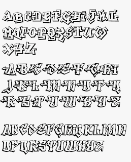
Typefaces
Though I would not use the premade typefaces on a project (at least not the one I am currently working on, maybe a quick flier for a concert, maybe not). However, I think that there are a couple great letters and I have used the bottom A and the top R. I also like the use of arrows.
Monday, May 16, 2011
Everfresh
Everfresh: Blackbook
This books is a documentary of the Everfresh studio in Melbourne, Australia. I really like that the book shows the art that these guys sell. It is neat that they can make a living being graffiti artists.
This books is a documentary of the Everfresh studio in Melbourne, Australia. I really like that the book shows the art that these guys sell. It is neat that they can make a living being graffiti artists.
Friday, May 13, 2011
colorful cartoons
I took these in Seattle, WA
I love the color and the cute cartoon characters. I like that there are several colors used together.
The lines making the text 3-d are then only part that is consistent or has solid tones.
Subscribe to:
Comments (Atom)


